Aero
sUMMARY
LOGO DESIGN
BRAND IDENTITY
BRAND IDENTITY
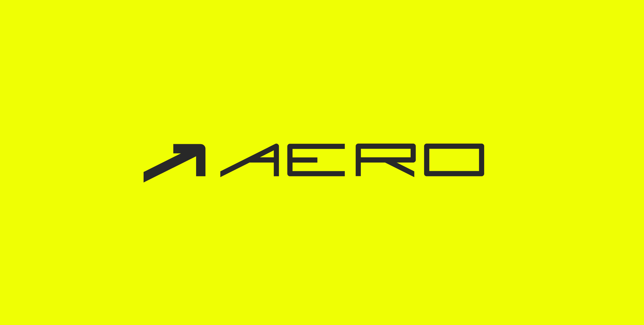
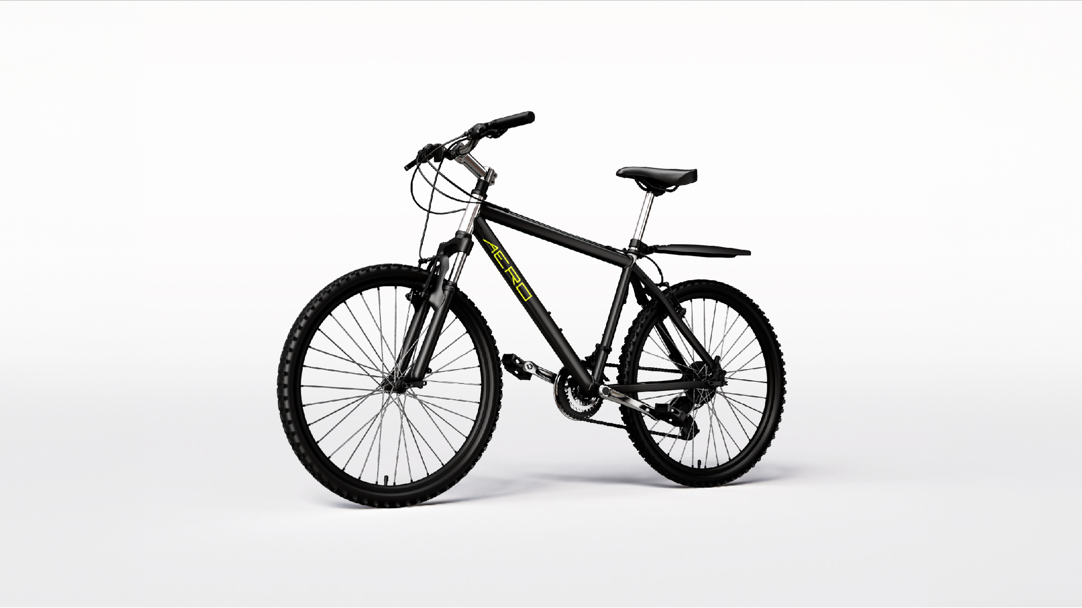
I designed the brand identity for Aero, an athletic bike brand inspired by the concept of aerodynamics. Created a custom typeface using geometric principles to evoke speed, precision, and modernity. The logo and branding materials emphasize sleek, dynamic visuals that reflect the performance-driven ethos of the brand. The project showcases innovative typography and a strong visual system, tailored for an active and competitive audience.


The GRID
I created this font myself, using the tools of Illustrator. I wanted the font to be extended for an athletic feel. The logo is meant to be used on the tube of a bike, so I kept that in mind when designing it. I used a grid to ensure meaningful proportions and I wanted to be very intentional. The arrow is also simpy the “A” but with its anatomy rearranged and with a thicker weight to stand out.